Co-founder · Product Designer & Strategist
Pagu App
Timeframe
2023 — 2025
Scope
0→1 Product · Germany & Brazil · Community Platform
Role
Co-founder · Product Designer & Strategist
Designing a community-first platform to create safe, inclusive spaces for FLINTA individuals through real-life connections and events.
260+
Research participants
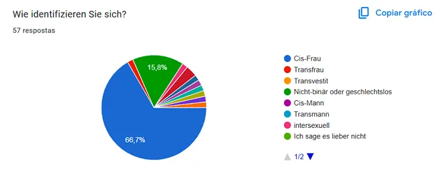
82%
Feel unsafe in mainstream spaces
70%
Seek deeper, non-romantic connections
0→1
Product built from scratch
01 — Context
A community-first platform for FLINTA individuals, across Germany and Brazil.
Pagu is an early-stage product that combines community, events, and a digital platform — designed around real-life connection and psychological safety.
02 — Challenge
Mainstream platforms weren't designed for safety, belonging, or this community.
- 01Lack of safe, inclusive platforms for FLINTA individuals.
- 02Existing digital products misaligned with actual community needs and behaviors.
- 03Real-world barriers to participation — safety, trust, accessibility.
Research insights — identity
03 — Approach
Three strategic pillars to design trust into a product from day one.
Research
What I did
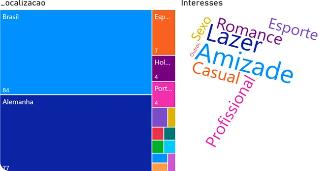
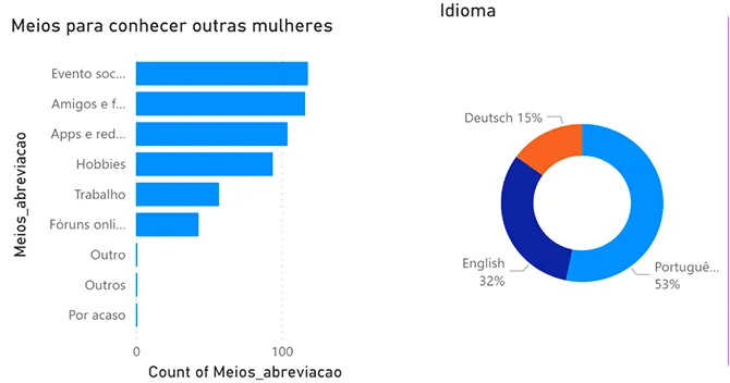
Ran a global survey with 260+ participants and in-depth qualitative interviews focused on safety, belonging, and behavior patterns.
Why it mattered
Ensured the product was grounded in lived experience rather than assumption — critical when designing for marginalized groups.
Business strategy
What I did
Defined the product vision, value model, and competitive positioning between community, events, and platform.
Why it mattered
Created a defensible path to growth without compromising on community-first principles.
Product design
What I did
Prototyped core features, shaped the brand identity, and designed the end-to-end experience from onboarding to events.
Why it mattered
Turned strategic intent into a tangible, testable product experience the community could shape.
Research — geography
Research — behaviour
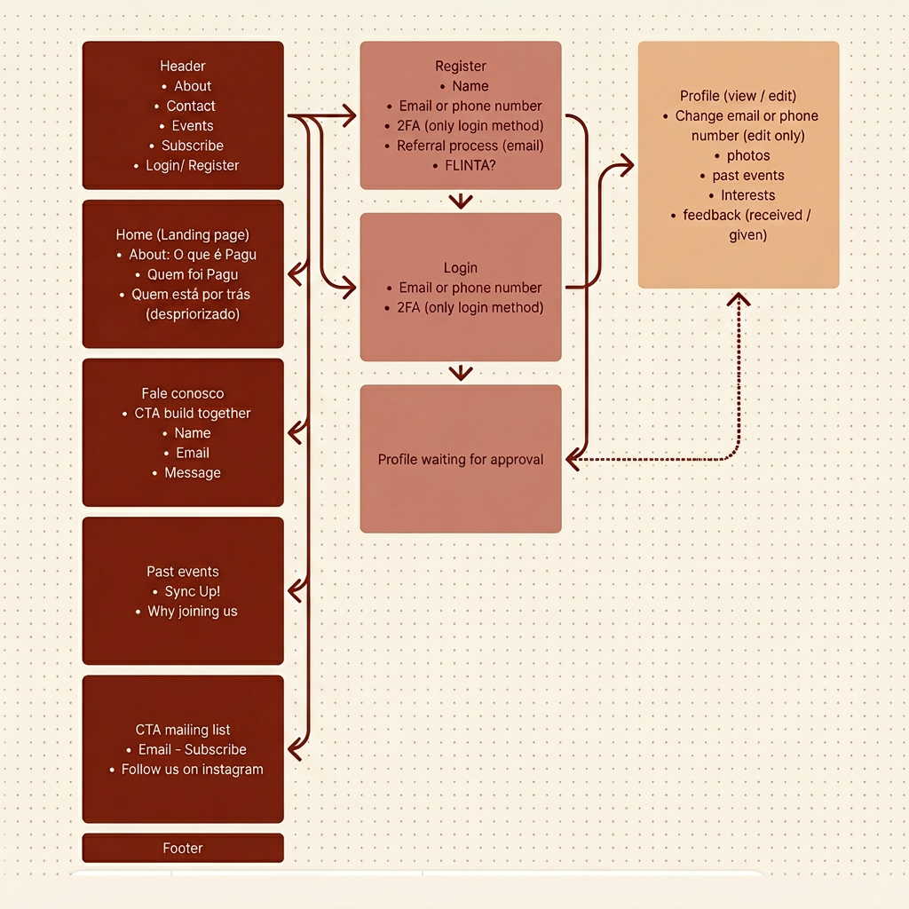
Information architecture
A sitemap built around safety, profile review and real-world events.
04 — Outcomes
A product foundation aligned with the community it serves.
- 01Clear product foundation and differentiation in a crowded social space.
- 02Strong alignment between community needs and product direction.
- 03Defined, scalable business model combining platform and events.
Brand & identity
A symbol that looks at people — not at profiles.


The core symbol of Pagu is a circle with a star, inspired by the iris of an eye.
The iris represents
- — Presence and attention
- — Humanity, intimacy, and closeness
- — Being seen and seeing others
- — Care and awareness
Pagu exists to look at people as they are — not as profiles, categories, or data points. The symbol reflects a space where individuals are recognised, not optimised.
The star inside the circle adds
- — Direction and guidance
- — Possibility and orientation
- — Individual brilliance within a collective
Together, the shape communicates soft strength — protective but open, simple but symbolic, intimate without being exclusive.
The dual palette — deep purple paired with warm sand — balances depth and warmth: grounded enough to feel safe, bright enough to feel inviting.
05 — Leadership impact
Bridging research, business, and design with a community-first lens.
- 01Connected research, business model, and design into one coherent direction.
- 02Built the product with a community-first mindset, not an extractive one.
- 03Positioned safety as a core UX principle — not a feature or disclaimer.
06 — Key learnings
What designing for marginalized communities taught me.
- 01Designing for marginalized groups requires trust, care, and slow decisions.
- 02A community-first approach genuinely challenges traditional platform logic.
- 03Belonging is a product outcome, not a feature you can ship.
More case studies
Global Head of Design
SMS Group GmbH
Transforming design from a fragmented function into a scalable, outcome-driven product capability across Europe and LATAM.
Read case →UX Strategy Consultant
Loot Studios
Defined a scalable UX strategy to transform a fast-growing subscription website into a structured digital product.
Read case →Let's collaborate
Have a complex product challenge?
I partner with teams to bring clarity, strategy, and structure to ambitious work.
Work with me →